For this class exercise, the two words that we picked were harmony and order.
Harmony

The rainbow has harmony among the colours and basic curved lines are used to create the rainbow.
Order
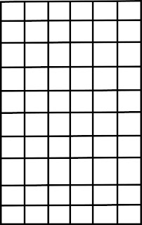
The structured horizontal and vertical lines gives people a feeling of order and seriousness.
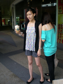
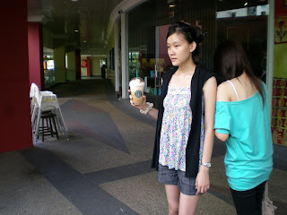
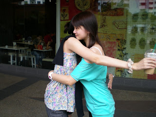
For this assignment, we have to create a sequence of 6-9 photographs to tell a photo narrative. I spent some time thinking about the story and here are 2 stories that I came up with.
1) Girl is looking at her bank account (only $50). She passed by her favourite store but can only look at the watch sadly as she does not have money to buy. She then reached the bus stop and suddenly she saw a $50 note! She excitedly thought of the watch which she could have bought with the money she had but thought of what her mother told her that people should be honest. Thus, she returned it to the police station.
2) Lesley was thinking about her primary school classmates and when she goes to Starbucks to get a drink, she bumps into her primary school friend, Elvina, whom she had not seen since graduation. It’s a great surprise to meet her again!
The problem with story 1 is the scene whereby the girl returns the money at the police station. There would be constraints to shoot this scene. Thus, I decided to proceed with story 2.
Sketch:

During the shoot, I tried out various shot sizes and angles.
Long Shot
Mid Shot
Close Up
Finally, here’s the photo narrative
 Comments from the class: One of my classmates pointed that for photo 5, there was too much blank spaces at the left side of the photo. But I felt that the photo was alright as I did not want to place my subject in the middle. I used the one-third rule for that photo.
I would like to thank both of my good friends, Lesley and Elvina for being my actresses! Both of you did great! (:
Our class exercise is to create iconic and indexic representations of a object.

The computer is the iconic representation as by the resemblance, everyone knows what it is. The mouse is the indexic representation as it suggests to people that it is related to the computer.
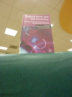
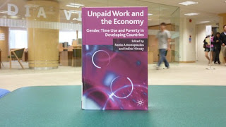
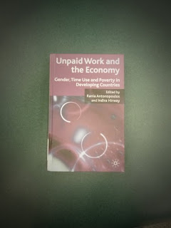
For this class exercise, we are required to make photo compositions in various shot sizes and camera angles. Kaleng and I decided to use this book in the school library as our subject.
Mid Shot
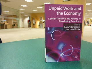
Mid shots are effective in introducing this book to the audience.
The subject and partial surroundings can be seen.
Close up
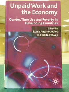
Close up shots allow the audience to focus on the subject in place. It also engages the audience more as there is an intimate relationship between the subject and the audience.
High Camera Angle
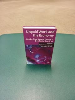
High camera angle shots give the audience a sense of empowerment. The audience will believe that they are able to conquer this book and understand it.
Low Camera Angle
Low camera angle shots make the audience look small and insignificant. The subject on the other hand looks powerful and threatening. The audience may feel that this book is difficult to read and attain.
Eye Level
The eye level shot is a familiar shot that the audience can associate with. The audience can look at the subject at ease.
Bird's Eye View
This shot is from a high angle and the lighting makes the atmosphere eerie.
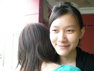
Over the Shoulder
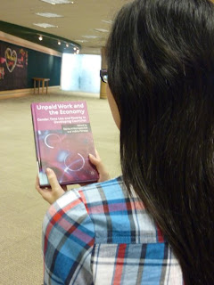
The over the shoulder shot is mostly used in film and videos. It gives emphasis on the book as the person’s features cannot be seen. The audience is able to focus more on the subject (book).
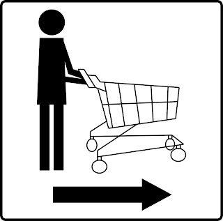
Our task is to create a pictogram for a site of our choice. I chose the supermarket trolley sign because I always have trouble finding where the trolleys are, thus I thought it would be a good idea to make it more visible to customers who shop at supermarkets.
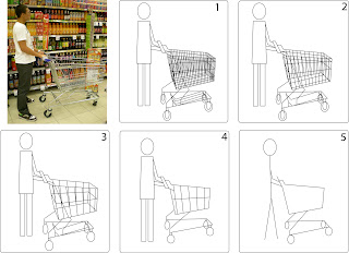
This was my initial abstraction that I presented in class. Miss Siti commented that my human did not change throughout the abstraction process, and that in abstraction 4 and 5, the picture can be zoomed in to emphasis on the trolley.
Thus, I traced out my human for the first abstraction and subsequently, simplify the human and the trolley. Finally in abstraction 4 and 5, the human is taken away, with a magnification on the trolley.
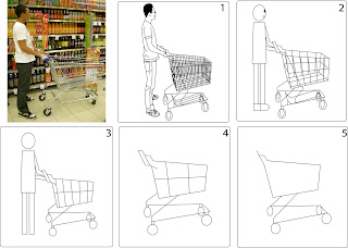
The pictogram I chose is abstraction 3. I chose this because the human is still inside the pictogram so that customers can understand that it is the trolley parking area. in addition, I bold the lines to make it more visible and added colour for the human. An arrow sign indicating the direction of the trolley area is shown as well.
Finally, this is the indicator.
This is the computer graphic version of my creation!

Comments from the class: Miss Siti thought that the whole creation is not complete due to the lack of background. It can be created as a magical theme. Some classmates commented that I can add in a cake stand with a transparent lid over or a table with a window background. I think that their ideas are great, so I shall work on it to include the background.
Here's the one with background:

I used pastel colours for the background to give it a serene feeling. It also allows the viewer to focus on my name.
 The rainbow has harmony among the colours and basic curved lines are used to create the rainbow.


