Friday, January 29, 2010
Assignment 1

I first came up with a mind map to categorise my likes and dislikes for example, I like to eat especially BBQ and Japanese food. By doing so, it helped me decide the areas I wanted to focus on for my 4 sketches. My name is Jasmine but most of my friends call me Jas, so I used “JAS” to create my artworks.
My first rough:
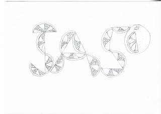
I love oranges especially the mandarin oranges I ate during Chinese New Year whereby I had to peel the orange into slices. Thus, I used the sliced oranges to represent my name.
My second rough:
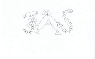
I don’t deny the fact that I do have a sweet tooth. I love chocolates, sweets and ice cream! Although it’s fattening for some, but I feel happy whenever I eat them. It sure lifts up one’s mood. It’s happy food! The candy and ice cream are used to create the ‘J’, sweets as ‘A’ and M&Ms as ‘S’.
My third rough:
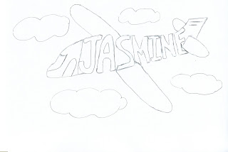
I love travelling, and whenever I am on an airplane, I would love to sit by the window to see the clouds and scenery. Thus, I integrated my name into the airplane. In addition, I added some clouds to make the drawing more wholesome.
My fourth rough:
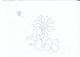
‘Jasmine’ is the name of a flower. Maybe that is the reason I love flowers! (: Sunflowers brightens up my day and its vibrant yellow colour describes my personality of being cheerful. In the beginning, I was thinking of ways to portray the letters ‘A’ and ‘S’. I thought of drawing smaller sunflowers beside the bigger ‘J’ sunflower. However, it looked complicated with 3 flowers together. Hence, I linked the ‘A’ and ‘S’ into the stem of the bigger sunflower. If you are wondering what the insect at the side is, it’s a ladybird!
After some thought among the 4 roughs, I chose the second rough (sweets) to improve on to 2 more sketches. I think it best represents me.
Sketch 1:
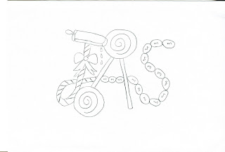
I felt that the letters were not connected in the initial sweets rough I created. Thus, I joined the ‘J’ and ‘S’ together as seen above. The sweets used for the letter ‘A’ in the initial rough did not seem apparent enough and I replaced it with lollipops. The top part of the ‘J’ was formed using ice cream, and I thought of the trouble I had whenever I was eating my ice cream. It melts easily in this hot weather and an idea popped up in my mind. That is to add the dripping effect to the ice cream!
Sketch 2:
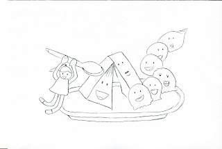
I developed this sketch after some time. I thought of the ‘A’ and ‘S’ first with the ‘A’ being represented with 2 cakes joining together and ice cream to form the ‘S’. The top part of the ‘J’ was formed using a spoon. It took me some time before thinking of the girl. The girl represents me holding a spoon ready to enjoy the delicious cakes and ice cream before me. Yum yum! I included the cute smiley faces into the cakes and ice cream to make the artwork livelier.
Comments from the class: Miss Siti thought that the first sketch was quite common among the students and the class seems to like the second sketch more. Initially I like the first one more because I came up with it first, but after listening to their comments, I decided to work on the second sketch. I was worried that the letter ‘J’ could not be recognised easily but the class commented it was alright. I thought I should change the ‘S’ to make it proportionate to the other letters but Mellissa said it is better to use various heights like the current one as it creates a more 3D effect.
I’m glad the class gave me good feedback on my sketch and I will continue to work on the second sketch into the computer graphic version. Till then! (:


